Monday, 28 March 2011

New inspirations of mix media


New inspirations of mix media


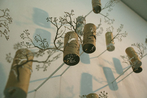
Yuken Teruya

Yuken Teruya is an artist based in New York. He works with various materials such as toilet paper rolls, paper shopping bags and butterfly chrysalises. His ideas often reflect life and history of Okinawa,his homeland.
Yuken Teruya's work proves that discarded everyday objects can be re-invented into something elegant and beautiful.He crafts toilet paper rolls with a level of detail so taht they adopt a new identity as delicately sculpted pieces-reminiscent of columnar wind chimes invterwined in the branches of a tree.


Tuesday, 22 March 2011

Paper experimenting


Paper experimenting


Inspired by the 3D wall art I mentioned before, I wanted to do some experiments with paper. I got some pieces of colourful paper which are in similar tone. I like this match of colours as they look very comfortable and clean, show in different depths. I didn't have any specific ideas about what I can make with them, so I just cut those pieces of paper in hearted shapes and put them together to see what they look like.

Saturday, 19 March 2011

Paper art inspirations


Paper art inspirations


I found these interesting paper work on a photographer's flickr,  unfortunately there is no information shows the name of the designer. In my view, this serious of work is very eye catching and creative, those 3D shapes of clouds, fire balloons and umbrella give the whole design a soul-----produce a dreamy fairy tale style as well as realistic. I have got a strong inspiration from this illustrative design and I plan to combine both 2D and 3D in my work, exploring with different materials and techniques to create a piece of unconventional design which is mentioned in the brief.

Thursday, 17 March 2011

Rough ideas for first illustration


Rough ideas for first illustration


When I listened to the song again and again, there were many scenes and ideas appeared in my mind. The atmosphere of the song is very brisk, cheerful and sweet, representing a lovely girl is falling in love with her mr.right and enjoying the sweet moment of missing him. Therefore, the initial word appeared in my brain to describe this emotion is " float away". A girl who immersed herself totally in her sweet fantasy as if floating in the sky and "lost in paradise". Based on this idea, I drew down some drafts to make it more clear. I have been looking into 3Dtechniques and think about what I could use in this project. My idea is to make the illustration look different and eye catching. Instead of being a piece of 2D hand drawing or digital work, I wanna to make something that the audience interact with as well as feeling the emotion of my chosen music.

Saturday, 12 March 2011

The sultry voice of Joanna Wang


The sultry voice of Joanna Wang


I listen to Chinese music all the time. I have heard many Taiwanese singers try to sing in English and fail miserably at it. Until now; I can safely say that I found a nice gem of a singer. Her name is Joanna Wang and her music style is a bit unfamiliar to the normal Taiwanese pop music style. Her English is spot on and her voice is most similar to Nora Jones.
Her album consists of 15 songs with 3 only sang in Chinese Mandarin. All the rest of the songs are in English which definitely makes her stand out and shows her confidence as an English singer. After listening through her album, there are definitely noteworthy songs on this album especially her single, Start From Here. The Chinese version of the song is titled “Maze”. She also sings the David Tao classic “I Love You” redone in English. Another notable song I enjoy is “Lost Tapei”, which gives me a sense of nostalgic feeling from my recent visits back to Taiwan and its hectic nightlife and buildings. If you have not heard of her yet, take note because her music is definitely worth the time to check out.
By RJC@DesignRJC on May 7, 2008

Wednesday, 8 December 2010

Evaluations

Well..I just feel a bit loss after getting everything done in this project..I talked more,learnt more and required myself more in these past 11 weeks..I was feeling very well when I made myself caught up with others as I was quite behind at the beginning.By doing this project I found that things always can be done better if I really push myself into them,when you looked back to your pay out and the progress you have made,you will totally forgot how tired you were.Just want to say thank you to Lizz,you are so responsible to each of us,I guess you have done a lot more work than any of us in this project.I found that looking at other people's work via their blogs is very helpful to me as sometimes I found difficult to understand the brief.Also want to say thank you to those of you who helped me on the way of this project,explaining what we needed to do,showing me what they have done...I will keep all these in mind as they are such nice memories in my career of studying abroad.However,I can also find my weaknesses by comparing with other people's work in this project,including poor time management,less explorations of using different softwares ect..oh,of course including my poor English speaking and spelling..I know these are the drawbacks stopping me to reach a higher level.I will really think of this and do someting to change this situation.. Alright..need to go to bed now,can't wait to hand in my finals and have a nice long sleep after all.Good night : )

Final Portfolio Pages

Finally I finished all the portfolio pages and here they are...I edited my dps and advert design based on the feed backs I have got,including correcting spelling and grammar mistakes.Due to some of the backgrounds of my design are white and grey,so that means I can't use those two colours as the background colour of my portfolio pages..I have tried a lot different colours and finally I chose a light pink to suit three of my designed images,and I think all the edges can be seen clearly in a pink background.But I still need to check out if it works well when I actually print them out.

Logo,Business Card & Letterhead Design


Illustration Design of Media City UK


Advertising Design for Abakhan


Double Page Spread Design (Manchester Chinatown)


Double Page Spread Design (Manchester Countryside)


Well...I have changed my mind..I don't think the pink frames are suitable in portfolio pages as they don't look professional and the pink might not stand out if I do some red or pink design in the future.So I set my porfolio pages in white and added a black frame for my images.I think they look tidy and great in this way.