Sunday 2 December 2012

Lino cutting experience


what would I change?
The topic of this assignment was change – what would I most like to change about the world if I have the ability? After a conversation with the tutor, I had my final thoughts – I wanted to change human’s cruel behaviors of killing wild animals. I decided to design three posters with the fox as the theme. In which form should the fox be presented, a bloody corpse, a figure aimed at by a gun, or a lively posture?  I chose the last one, because I wanted to let the audience love them, show mercy to them and oppose the brutal and bloody killings by portraying their nature and beauty.

Final ideas
First of all, I drafted a few foxes on a sketchbook with a pencil in simple and smooth lines to highlight the beautiful gesture of foxes. Then I added some flowers as a background and determined the final draft after repeated modifications. After that, I copied those sketches on the lino with tracing papers and deepened them with a pencil. 

Making process
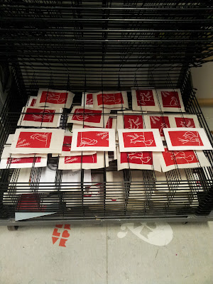
 After that, I copied those sketches on the lino with tracing papers and deepened them with a pencil. Then I started carving along the mark carefully with a pencil. After the caving was finished, I brought them to the printing room for printing. As there was only one machine in the printing room and there were a number of people queuing, each of whom wanted the lino to be produced in different thickness, so the machine was constantly adjusted and I could not accurately fix it at the appropriate pressure strength. Consequently, the result of the first test was not good – the color was uneven, the paint was either too much or too little, accompanied with other minor problems.

Making Process 2
There were not many people in the printing room when I did my second test, so I could adjust the paint and the printing machine little by little. I tried two colors – dark red and orange – on paper of different materials. This time I tried a lot of printing and most of which produced good results. Looking at the results of my own effort, I feel so happy.

Friday 2 November 2012

The Manchester first cut compitition


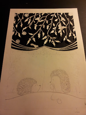
I am so happy that my work was selected in the Manchester first cut compitition. The more exciting thing is my little hedgehog paper cut illustration will be realised as a greetings cards by stationer Roger La Borde.

Monday 29 October 2012

The Cutting Process


After I came up with the final illustration, I started to cut. I took quite a while to cut all the small edges of the Christmas leaves and the little stings of the hedgehog. I separated the design in two parts. The upper part is to get rid of the rest part of paper and the bottom part is to cut out the drawings. I think this makes an nice eye contrast. I spent two days on cutting in total and I really enjoyed it. I was satisfied with the final outcome but I think I could have done better if had repare more.

Sunday 28 October 2012

Second Idea


 I showed my first design draft to my tutor and he advised me to get rid of the texts and maybe changed the cactus to another hedgehog as it might be confused. So that I created this design,The message of it is passing love, to me this is the design that warms and comforts. I hope the audiences could sense the love and warmth when they look at it.

Saturday 27 October 2012

Rough Ideas

Inspired by the video and images during the research, I came up with the first idea which is to design a fairy tale style illustration based on a love story between a hedgehog and a cactus.

The theme of this design is Passing Love, I drew some leaves and snows in the background reprsent the cold in winter, the little hedgehog is passing a glove to a cactus. In the middle I inserted some texts which is a sentence inspiring me.


Thursday 25 October 2012

Wednesday 24 October 2012

Inspiring Images of Hedgehogs


Images From

http://lilyhogshedgehogs.weebly.com/hedgehog-care.html
http://gardenofeaden.blogspot.com/2012/08/the-hedgehog.html
http://www.tpicks.com/fascinating_photos.htm
http://www.tumblr.com/tagged/sherlock-bbc?before=1351730831

Hedgehog in the mist


This is a Russian animated video and it's a story about a little hedgehog (voiced by Mariya Vinogradova) and his friend bear cub (voiced by Vyacheslav Nevinniy). The two would meet every evening to drink tea from the cub's samovar, which was heated on a fire of juniper twigs. As they drank their tea, the hedgehog and the bear conversed and counted the stars together. One day, the hedgehog decided to bring raspberry jam. As he went to the bear to count the stars, he passed through the woods and found a horse standing in a fog, where the hedgehog can't even see his own pink paw. He is curious as to whether the horse would drown if it went to sleep in the fog. The hedgehog decides to explore the fog.
 I think the meaning of this film is captured in the final thoughts of the hedghog. Most experience moving away from the familiar, and these experiences could also be those of an adult going off for travel or war, only to come home a bit dazed about what they have experienced. And the hedgehog thought, "Isn't it wonderful that we are together again" as he wonders about "the horse", the very thing that took him off his original path. In other words, "there's no place like home"

http://www.youtube.com/watch?v=oW0jvJC2rvM 

The Manchester First Cut Exhibition

I visited the Manchester First Cut Exhibition in the Manchester Art Gallery and it's absolute amazing.There are some very interesting works in different scales and in both 2D and 3D.I was very inspired by Peter Callesen's 3D paper cuts, the way he used nagative spaces and the tiny little sculptures he built up are all interesting.


Tuesday 23 October 2012

Inspiring Artists: Béatrice Coron


Béatrice Coron 

Meet acclaimed French artist Béatrice Coron, who will talk about the silhouette worlds she invents, cutting them into existence from single sheets of paper. Coron, a self-taught paper-cutter, first became familiar with cutting techniques in her native France, developing her interest and skill further while living in China. Her hand-cut compositions, often populated with hundreds of carefully crafted figures, appear to burst with activity and life. Now based in New York, Coron’s work has been well received and is included in the collections of the Metropolitan Museum of Art, the National Gallery of Art, and the Bibliothèque Nationale de France. She has received several public art commissions including New York’s and Chicago’s respective Transit Authorities.


http://www.fibermark.com/heroes/faces/beatricecoron/
http://raven2009.wordpress.com/2012/01/09/beatrice-coron/


http://www.youtube.com/watch?v=cAGFKYNrQgY

Elsa Mora


Elsa Mora

Elas Mora is one of my faverite paper cut artists who creates incredible exquisite designs.I am really impressived by the fairy tale style illustrations showed in her paper cut pieces.
While we're all used to seeing intricate papercut art, it's not often we come across pieces with interesting meanings behind them. Los Angeles-based multimedia artist Elsa Mora (aka Elsita) created this beautiful papercut piece called Fear that shows a person who has turned into a forest with two little people hanging on the leaves.
"In the forest that our mind is there is always the presence of fears," Elsita says on her website. "I tend to see fear as two little people having an argument within my mind. One of them is positive, the other one is negative but in the end I am both of them. I am aware of how much I can influence their argument, it all depends on my own personal choice of whom I am going to support and let win. This piece in the photos is a representation of this idea. I think that it is a good thing to own our fears and not the other way around, don't you think?  "Have a wonderful day my friend and don't be afraid of trying something new in your life once in a while."


Image Sources:

http://fjkl.tumblr.com/
http://www.flickr.com/photos/neilanddina/5576642037/
http://www.design-vagabond.com/2008_11_01_archive.html
http://crookedhouse.typepad.com/paper_and_felt/2011/04/elsa-moras-paper-cut-pop-up-book-in-progress.html

Wednesday 9 May 2012

Final Poster Design

I edited the draft in Photoshop, and I tried painting it in different colour to see different effects. I finally choose the blue one as it has a strong vusual affect. I am happy with this final outcome as it looks like Chinese paper cutting  art.


sketches

I decided to design an illustration of Salford Totem pole and make it a poster. I did a lot research of the apperance of the Salford totem pole, however, I couldn't find any images that can show what it looks like clearly, so that I redesign the parts I couldn't see.


Salford Totem Poles


SALFORD TOTEM POLE

Hidden deep in a warehouse somewhere in Salford Quays was the once proud Salford Totem Pole which stood on the Quays for nearly 40 years until it was removed for safety reasons.
The pole has now been rescued by Councillor Steve Coen and currently resides in the Lowry Outlet Mall! Dreamscope, alongside journalist Saréda Dirir, are following the progress of the renovation by 1st nation American Kevin Cranmer (the great-nephew of Doug Cranmer who originally carved the pole back in 1969).
Salford's totem pole has been restored to its former glory. The 32ft, two-and-a-half-ton structure is once again a vibrant red and green, crowned by the head of a Thunderbird with its vivid yellow beak.
It is likely to be put inside a public building in Salford Quays, although a decision is yet to be made about the exact location.
The pole was commissioned by Robert Stoker, the then chairman of Manchester Liners and unveiled in 1969 in the company’s grounds in the Quays.
It was meant to be a permanent testimony to trade links between Manchester and Canada. But in 2006 it was taken down after falling into disrepair.
OOCL, the company which took over Manchester Liners, moved it to their depot in Felixstowe. But Salford councillor Steve Coen began a campaign to bring it back and the totem was returned in 2007. Repair work was started late last year.
The pole was carved by Chief Pal Nakwala Wakas – alias Doug Cramner – of the Kwakwaka’wakw tribe, from British Columbia, Canada.
His nephew, Kevin Cramner, travelled to Salford to lead the repair work, which used cedar imported from Canada.
OOCL paid for Kevin’s flight and the firm was among a number of businesses whcih helped to pay for the repair work. Two community committees, affiliated to the council, contributed £1,000 each. A lot of the work was done in kind. There are four symbolic designs on the pole – the Great Eagle or Thunderbird, representing family and solidarity; the Killer Whale, master of the seas; the raven, a messenger and symbol of trade; and copper coins, a sign of wealth and power.
The pole is currently on show in the Museum Of Museums at the Trafford Centre. Coun Coen said: "I think it is wonderful that it has been restored. It is up to the people of Salford to decide where it should be put up. But I would hope it is at Salford Quays, facing Canada."
When the pole is rededicated next year there will be a ceremony with native Americans in memory of Doug Cranmer who died in 2006.
It is also hoped Lakota native Americans from South Dakota will attend. Their ancestors came over with Buffalo Bill's Wild West show 100 years ago and camped on the site which is now Media City.


http://www.dreamscope.tv/additional/salford-totem-pole
http://menmedia.co.uk/manchestereveningnews/news/s/1312853_salfords_thunderbird_totem_is_go_once_again
http://www.bbc.co.uk/manchester/content/articles/2007/01/03/030107_totem_home_feature.shtml