Well..I just feel a bit loss after getting everything done in this project..I talked more,learnt more and required myself more in these past 11 weeks..I was feeling very well when I made myself caught up with others as I was quite behind at the beginning.By doing this project I found that things always can be done better if I really push myself into them,when you looked back to your pay out and the progress you have made,you will totally forgot how tired you were.Just want to say thank you to Lizz,you are so responsible to each of us,I guess you have done a lot more work than any of us in this project.I found that looking at other people's work via their blogs is very helpful to me as sometimes I found difficult to understand the brief.Also want to say thank you to those of you who helped me on the way of this project,explaining what we needed to do,showing me what they have done...I will keep all these in mind as they are such nice memories in my career of studying abroad.However,I can also find my weaknesses by comparing with other people's work in this project,including poor time management,less explorations of using different softwares ect..oh,of course including my poor English speaking and spelling..I know these are the drawbacks stopping me to reach a higher level.I will really think of this and do someting to change this situation.. Alright..need to go to bed now,can't wait to hand in my finals and have a nice long sleep after all.Good night : )
Wednesday, 8 December 2010
Final Portfolio Pages
Finally I finished all the portfolio pages and here they are...I edited my dps and advert design based on the feed backs I have got,including correcting spelling and grammar mistakes.Due to some of the backgrounds of my design are white and grey,so that means I can't use those two colours as the background colour of my portfolio pages..I have tried a lot different colours and finally I chose a light pink to suit three of my designed images,and I think all the edges can be seen clearly in a pink background.But I still need to check out if it works well when I actually print them out.
Logo,Business Card & Letterhead Design
Illustration Design of Media City UK
Advertising Design for Abakhan
Double Page Spread Design (Manchester Chinatown)
Double Page Spread Design (Manchester Countryside)
Well...I have changed my mind..I don't think the pink frames are suitable in portfolio pages as they don't look professional and the pink might not stand out if I do some red or pink design in the future.So I set my porfolio pages in white and added a black frame for my images.I think they look tidy and great in this way.
Tuesday, 7 December 2010
Final Illustration Design of Media City UK
I should have this done ages ago but there are always something need to be improved..here it is! My final illustration design of Media City.In general I was happy with the result as this effect is exactly what I want,and it is presenting a message which is : Media City can be created by your hands.I think the idea of cat's cradle works very well in this design,and it is also accord with the concept I wanted to present before: showing people the strength of their hands.However,there are still some defects I can find in this design,such as the knitting lines of media city are not connected well,and there are some small gaps I can see between the red strings and my fingers.
Developments of Media City Illustration
This is the illustration design I did 3 weeks ago.Although it is showing the idea of combining elements of Media City with cat's cradle,the design itself doesn't look professional because of the rough background.I decided to keep the knitting lines and the photographs of my hands and redesign a background for them.
Firstly I adjusted the brightness and contrast of the whole image to get rid of the background.
After that I wanted to experiment with some lighting effects in Photoshop and see what effects I can get.
Among the experiments I have done I was particular interested in this ringed light shadows.
I changed the light effects to metal colour as it looks modern and it also presents the atmosphere of future developments of Media City UK.
what I was thinking tonight.
"Love you do,do what you love".
I always envy the people who can actually make it.It seems that they had so much fun while working and living in their world..
I was totally tired and fed up with all the project work this week..I just hate getting everything done at the last minute.Why things are always getting bored when I spent too much time on them?? I really need to find out a way to change this,to change my attitude.
http://hrrrthrrr.tumblr.com/
This is a tumblr address of an interior designer who I think is totally enthusiastic about her design,her career and her life.I can see passions through her sketches,photography and details of everday life.Hope I will live a life which I have been looking forward to and be happier than now. What to say a lot more..but found hard to explain in English..such a shame...
Monday, 6 December 2010
some work I did but not use for this project
I made a wrong choice on the advert design before which was adverted for a baby photographer.After talked to Lizz I found that I was mistaken on the target audience.Although I made a wrong desicion,I still did a design for Jolie Anne's photographic studio by using her babies photography.I made a combination of her sleeping babies..I think I will keep working on it as those innocent faces really really appeal to me..
Sunday, 28 November 2010
group feedback
Editorial Flow
Countryside These are very nice layouts you have here but im not too sure on the type, consider thinking of a different font or even a different place for it to go, your title should be noticed not cluttered around all your context.
China Town very nice layout but don’t forget about your margins, it looks like your work may be clipped when printing due to your images being so close to the edge.
Abakhan very suttle design, i love the layout and the colors reflect on the advert itself, also good use of imagery. well done
Typography
No problems at all i really like this piece. The body text might work better in columns
China Town heading could probably find a better typeface, the body typeface is great though. Bottom right section is abit hard to read because of the colour
Copy
Countryside No mistakes, great thought
China Town No spelling mistakes, great punciality
Abakhan Well done! No complaints
Grid
Countryside The layout is very good we like how the text and the images are balanced and work well together.
China Town The grid used is very similar but effective to the first with a good balance of text and images on either side of the DPS
Abakhan The advert grid is very central with good use of colour, also we like the text and how it has been placed at the side of the image.
Image
Countryside no problems with the images in this design, looks good.
China Town same as countryside looks v-good. nice one.
Abakhan prob my fav out of them all since you made the cloth dress(like) thing yourself, very professional.
Wednesday, 24 November 2010
Final editorial design and advert

Layout for article 1 (Manchester Countryside)
Layout for article 2 (Manchester Chinatown)
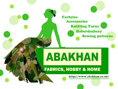
Final advert of Abakhan
Final layout
So..this is the final layout for the Chiantown article.Although I think it looks nice,I still want to try to do it again in In Design.I think it will be more helpful with doing editorial designs.
More images
I selected these images on line and I think they are showing very strong Chinese atmosphere,I think it's easy for the audience to recognize the article is about Chinatown.
Chinese lanterns
Characters made of mud
Chinese Mammon
Chinese Dim Sum
Manchester Chinatown
All images above are found from
Based on some datum and information of Manchester Chinatown.I came up with this article.It is about introducing the appearance,shops,history and significance to both oversea Chinese and local citizens of Manchester Chinatown.
Manchester Chinatown is a small self-sufficient block with rich Chinese atmosphere. Right at the front of the town, there is a typical torii decorated with roofing tiles and painted by festive colors. The drawing of dragons and phoenixes in the arch convey a sense of auspiciousness. The torii is a symbol of Chinese culture in the foreign land that binds the Chinamen together. It is a widely recognized indication of Chinese enclave in the city of Manchester.
Densely-populated with restaurants, supermarkets, clinics, law firms and so on, the town has everything needed for a comfortable life. The clusters of Chinese restaurants would fill the town with appetizing fragrance everyday. And the streets would be flooded with tourists in weekends.
The diverse cultural activity is also a magnate. You could buy newspapers that are transported here by charter planes from Hong Kong or mainland China. In lunar New Year or other traditional Chinese festivals, the streets of the town would be filled with people, both Chinese and others. They would participate in dragon-dancing and lion-dancing, laughing and singing for the celebration of a new year. The firecracker, the gongs and drums create such a joyful atmosphere that the wanderers would feel at home again.
Manchester Chinatown first appeared in early 1970s. With the support of local diners and the great effort of the owners, the Chinese dining industry gained great momentum at one time, the popularity of which also provided business opportunities for other service industries. The success of traditional Chinese service such as acupuncture attracts a lot of Chinese businessmen to settle here. It took only about 40 years for the Chinese here to build such a thriving community—Manchester Chinatown. It demonstrates the great diligence of Chinese people.
The industries, hard-earned by the Chinese people, were severely damaged by the financial crisis. Yang Juwen and Yang Jusen from Hong Kong, who are the founders of Yang Sing, the one praised by the English media as “the best Chinese restaurant in Europe”, saw their first high-end hotel in Britain going bankrupt in just 8 months after its establishment because of the financial tsunami. The economic crisis presents a grave challenge to the Chinese people in dining industry or other service sectors.
The population expansion of overseas Chinese gives new features to Chinatown all over the world. For a start, immigrants no longer restrict their choice of settlement to old-style Chinese communities. Therefore, many Chinatowns face the dilemma of population loss and aging. In fact, most of the Chinatowns is packed with people and squeezed in old city district. Ethnic conflicts and security issues arise time and time again. The Manchester China town is no exception. Today, the town is more like a “showplace of Chinese culture” for the reason that the initial purpose of Chinese people settling down together has been weakened and the town serves as a culture hub that attracts many local citizens.
article layout design
Before starting to make the layouts,I did want to do it by In Design to learn more skills,but I found that I still got too much to learn and there's not enough time for me to practice.So I designed this layout in Coreldraw which I am a bit more familiar with.Based on some introductions of Manchester countrysides I found on line,I did this article which mainly introduces the road maps for visiting and I organized a list of scenery which people might be interested.
Manchester Countryside (illustrations)
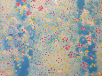
The first article is to introduce some beautiful contryside areas around Greater Manchester.Advised by Lizz,I decided to make some illustrations instead of using photographs only.Inspired by the blossom images and jelly bean blossom paintings,I designed two illustrations with oil pastels and watercolour.The reason why I chose to work with them is these two materials can not be mixed. I was happy with my drawings as they show petals flying into the sky,and that is the effect I want.
Tuesday, 23 November 2010
Final advert
This is the final advert I designed for Abakhan.I was happy with it as the collage dress and the lady figure matches nicely.What is your opinions?
First advert and problems
This was the final design for the advert.I was quite happy when the effect came out but I didn't realised there are some detailing problems.The image blow is the feedback with notes from Lizz,she picked out the problems of my design.
final character design
I painted the female body in green and cut out the edges in photoshop.So..this is the character for my advert and later I will designthe background of it. Any comments?
Precesses
Firstly I drew a sitting female figure with a long dress.The reason why I designed the character in a sitting position is I later will use the logo of Abakhan as a "chair".After finishing the outline with pencils,I started to make the collage piece of the long dress.I cut the ribbons and fabrics in small leaf shapes and pasted them regularly along the edges of dress.After that I added some small buttons and bowknots on the top as decorations.
Inspirations
I bought some Fru lime flavour cheese cakes last week and this is the packaging design.The illustration really appealed to me because of its simple and elegant style.I got a strong inspiration from this and I decided to design a female character for my advert as the mainly consumer of Abakhan are females.
collage illustration (materials)
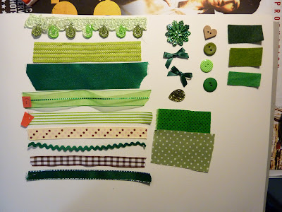
Based on the green & white logo of Abakhan,I decided to make a collage piece using some fabrics and accessorize I bought from the shop.I want my collage piece suits the logo so that I selected the fabrics and accessorize which are in different depths of green.
Thursday, 18 November 2010
New idea for advert
Well..after spoke to Liz I realized that the target audience are graphic students!!So obviously Jolie Ann's photography is more suitable for visual sources but not for an advert..Unfortunately I spent a whole night last night creating an illustration of babies and now that makes me cry..
Anyway I come up with a new idea which is to advert for the Abakhan farbric shop in Manchester.I bought different types of farbric there for the patchwork project and I think I can use the rest of them to creat a collage piece for advertising the shop.
Anyway I come up with a new idea which is to advert for the Abakhan farbric shop in Manchester.I bought different types of farbric there for the patchwork project and I think I can use the rest of them to creat a collage piece for advertising the shop.
website links:http://www.abakhan.co.uk/acatalog/Fabrics.html
Wednesday, 17 November 2010
Idea for advert
Jolie Anne is one of my favourite photographers and her photographs of babies ,mothers and families make me cry! I love her photos so much and I want to design an advert for her blog.
"Jolie Anne is a natural light photographer that specializes in Maternity, Newborn and Children, Her style is Modern, Fresh, and bright for fun and creative images you will treasure for a life time."
Here's the link for her offical website.http://www.jolieannephotography.com/
Blog http://jolieannephotographyblog.com/
Etsy shop http://www.etsy.com/shop/joliem6201
And these are some of her photographs which are really appealed to me.
Subscribe to:
Posts (Atom)


