Editorial Flow
Countryside These are very nice layouts you have here but im not too sure on the type, consider thinking of a different font or even a different place for it to go, your title should be noticed not cluttered around all your context.
China Town very nice layout but don’t forget about your margins, it looks like your work may be clipped when printing due to your images being so close to the edge.
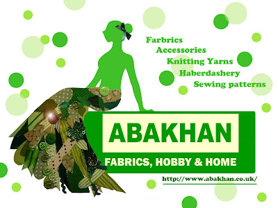
Abakhan very suttle design, i love the layout and the colors reflect on the advert itself, also good use of imagery. well done
Typography
No problems at all i really like this piece. The body text might work better in columns
China Town heading could probably find a better typeface, the body typeface is great though. Bottom right section is abit hard to read because of the colour
Copy
Countryside No mistakes, great thought
China Town No spelling mistakes, great punciality
Abakhan Well done! No complaints
Grid
Countryside The layout is very good we like how the text and the images are balanced and work well together.
China Town The grid used is very similar but effective to the first with a good balance of text and images on either side of the DPS
Abakhan The advert grid is very central with good use of colour, also we like the text and how it has been placed at the side of the image.
Image
Countryside no problems with the images in this design, looks good.
China Town same as countryside looks v-good. nice one.
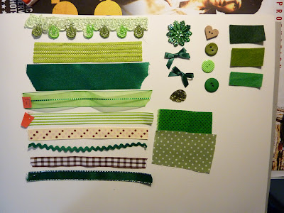
Abakhan prob my fav out of them all since you made the cloth dress(like) thing yourself, very professional.


